Accessibility @ CfA
Research / Design / Development
2018
Driven by a policy-change that expanded the reach of food stamps in California, we took the opportunity to improve our accessibility standards first for GetCalFresh and then for all services at Code for America.
The services don’t come to you. You gotta go to them.
- Sacramento resident
My biggest expense is rent. I pay $700 in rent. I get $950 in income.
- Culver City resident
In 2018, Jerry Brown, then out-going governor of California, signed legislation that opened up CalFresh (food stamps) to over 500,000 low-income seniors and people with disabilities.
When the State of California asked us to provide the official online service for CalFresh enrollment, we wanted to ensure that our service, GetCalFresh, would be ready to receive the influx of newly eligible applicants. We knew our clients’ access to food depended on our ability to get it right.
It can be easy to be caught up in “accessibility theater” by meeting a general checklist of criteria without understanding if it holds up in real situations. To ensure GetCalFresh was truly accessible, we took an approach that we think is key to doing anything well:
- Take time to develop true care and understanding
- Find ways to meaningfully improve our service
- Embed learnings into our culture
Taking the time to develop true care and understanding
We approached our research through three separate efforts: learning from users, learning from subject matter experts, and early prototyping. We sought to answer some basic questions. Who were the people we would be helping? What are their lives actually like? What would it mean for them to successfully apply for CalFresh?
A team of three talented user researchers and two data scientists who led a discovery research effort.
- Data analysis: We started with a review of demographic data to make sure we were addressing the right populations.
- User research: Based on that data, we conducted interviews with dozens of people living on Supplemental Security Income (SSI) across the state.
- Community engagement: We established regular communication with community and government partners so that we were plugged into the conversation.

A report put together by our data science team that helped us to make sure we were talking to the right balance of people during our discovery research.

Testing an early paper prototype with research participants.

A report put together by Knowbility documenting accessibility issues found in our design and code.

An SF Design Week event about Accessible Design Systems with presenters from Google, Lyft, and LinkedIn.
It was also important to recognize when to build on work of others. In addition to conducing primary research, we sought guidance from the established community of practice around accessibility.
- We conducted an accessibility audit with a non-profit organization called Knowbility. We picked them because of their mission alignment and because they had people with disabilities as part of their team.
- We reviewed accessibility guidelines from other well-respected organizations such as W3C, GDS, and 18F.
- We attended a local talks to learn from the best of Silicon Valley including Google and Lyft.
Accessibility wasn’t a new concept for many of us at Code for America. Even before we got deep into research, we already had many ideas of what we could do to improve our service. As we conducted early research, we took that opportunity to understand their ability to use our application. We had ideation sessions early and brought prototypes out with us.

The research team synthesizing findings from their trips throughout California.
Finding ways to meaningfully improve our service
A major improvement in our service was rethinking our design system from the bottom up. This project gave us an oppourtunity to reconsider fundamental aspects of our system such as color, type, layout, and basic HTML elements. Each of these units were redesigned thoughtfully with accessibility at the forefront.

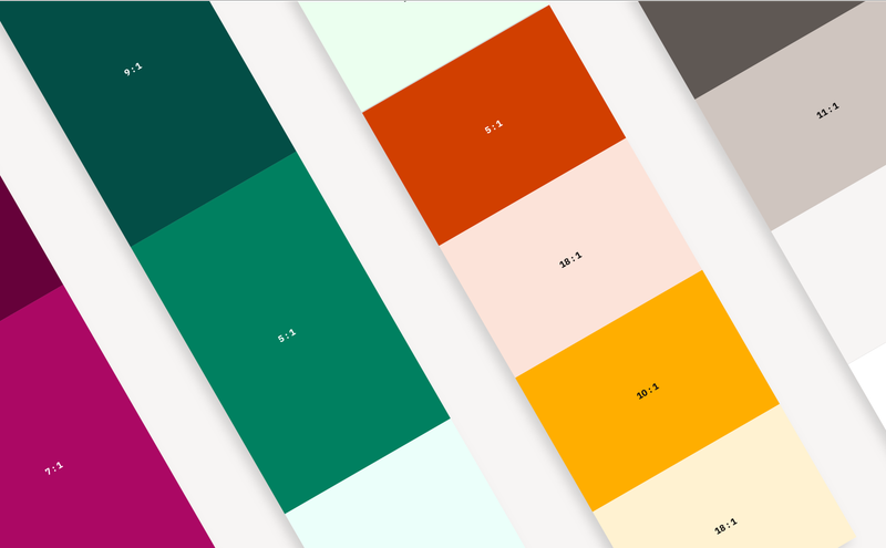
We started by refining our color system both by reducing the colors used and making sure each color passed WCAG Level AA contrast guidelines.

Inspired by golden proportions, we defined a sizing system that would be used to define everything else in our design system including typography, patterns, and layout. This provided an easy to understand system for designers and engineers alike to ensure a clear and consistent hierarchy.

We simplified and strengthened the type hierarchy used across our service based on our spacing system. This helped to ease cognitive load by improving readability and made our service more accessible to screen readers. We also darkened the color of detail text to fix readability issues found in usability testing.

We more clearly outlined, increased the size, and bumped the contrast of interactive elements. We also used rounded corners and depth to distinguish buttons from inputs. Sizing, spacing, and rounding of elements are all based on golden proportions.
As a bonus, we also evolved our logo to be slightly easier on the eyes. Admittedly, this was for the designers more than anyone else =)
We also developed some insights that very few people talk about. For example, we saw first-hand the challenges that people with cognitive disabilities face — and how little we as a design community knew about how to help them. We also learned not to assume familiarity with basic mobile norms such as expanding accordions and scrolling, especially for older adults.

We simplified our layout to be fully left aligned. This helped to reduce cognitive load on people who already had high anxiety, stress, or mental incapacities.

We adjusted the language we used in order to reduce anxiety. For instance, we clarified why we were asking certain “trigger” questions. In another example, instead of asking for how much money the applicant had saved up, we simply asked if they had below a certain threshold (and why it matters).

Many of our older clients did not intuitively know to scroll. We added a conditional scrolling indicator that only showed up if we did not detect scrolling after a few seconds (and would disappear once they did). While many of us had advocated for a dedicated back button in the past, research evidence helped us to push this feature to the top of the queue.
I help her financially. Shopping, heavy lifting, I cook for her… I started to help her at a young age. She’s my mom so…
- Los Angeles resident
A simple yet valuable insight we had was that that seniors and people with disabilities do not exist in a vacuum. More often than not, you’ll find a wide network of helpers who assist them with their needs. This could be an adult child or sibling who cares for and represents them, an IHSS (In Home Supportive Services) worker who helps their perform daily activities, or the lobbyist at the senior home that connect them with services.
True accessibility means making services accessible to the people who care for them.

We added screens that acknowledged the presence of “helpers.” By passing this information through to the county, we were empowering the people who aided seniors and people with disabilities to play their part.
Embedding learnings into our culture
We had clear improvements to make on GetCalFresh but we also wanted to make sure that our learnings would be useful to the broader organization. In additional to improvements to our service, we made embedded the learnings into our operations and culture so that future features and services could benefit from our work.
- We regularly encouraged colleagues from all teams to join in on research and usability testing to see the people we were helping first hand.
- We created a set of accessibility standards that gave clear metrics for measurement as well as examples of why a particular standard was important for a real user.
- We incorporated broader changes into our design system so that any accessible visual or code changes would be embedded any time a pattern was used in the future.
- Designers were asked to install browser plug-ins like WAVE and Sketch plug-ins like Stark Contrast Checker to make sure we were designing and developing to guidelines.
- We incorporated testing suites and practices during implementation and story acceptance to make sure that future development work met basic accessibility needs.
- We set up office installations and and presented research to the broader organization to help others understand the lived experiences of low-income seniors and adults with disabilities.
Impact
On June 1st, 2019, CalFresh opened up to the 1.3 million people who lived on Supplementary Security Income in California. Our service experienced a five-fold increase in the number of applications coming in that week. As of August 2019, we have helped over 200,000 SSI recipients apply for CalFresh. Our rate of completion and satisfaction remain steady.
Over the last few months, we have developed a much deeper understanding of accessibility at Code for America. We have helped others in the organization understand why accessibility is important in the real world and made it easier incorporate accessibility into their work.
Of course, our work remains unfinished. The last key point to doing accessibility well is to remember that your work is never done. Even at this moment, we are continuing to evaluate the effectiveness of our work through surveys and continued usability testing. We have a long way to go to get our copywriting down to a 5th grade reading level. We plan on deepening our understanding of true accessibility by partnering with Lighthouse Labs and working directly with more people who are vision-impaired. Our understanding of how to better serve and collect feedback from people with cognitive disabilities is still painfully low.
There will always be new additional challenges to tackle and biases to uncover. We are excited to keep our users at the center and push the envelope for what it means to be truly accessible.

Our researchers put up a walkthrough of research insights for everyone in the office to see.

Our team partnered with Meals on Wheels to conduct usability testing. We made sure to provide opportunities for everyone on the team to come along.